The Psychology of Color & What Your Brand Palette Says About You: A Sit-Down w/ Madison+Main’s Design Team
Written by: Zoe Norris
Color does more than define a brand. It whispers trust, shouts excitement, or sings luxury, depending on the hues you choose. Whether you realize it or not, your company’s branding palette is sending signals that influence how customers feel, think, and behave. In this blog, we’ll explore how color psychology shapes brand perception. Let’s talk tones, tints, and truths with our award-winning in-house design team, and learn what your brand’s palette says about you!
What is Color Psychology?
Color isn’t just decoration; it’s communication. Here’s why color psychology should be on your radar. The Colors brands use can trigger emotional responses and influence the way we view products, and spaces. Ever wonder why you feel so drawn to some of your favorite brands without even realizing it? It’s not magic, it’s science! Hubspot’s publication notes, “Up to 90% of an initial impression comes from color.” Businesses use color to align with their companies values and help their brand stand out from competitors. In a saturated market, differentiation from other brands is key when it comes to standing out and staying fresh.
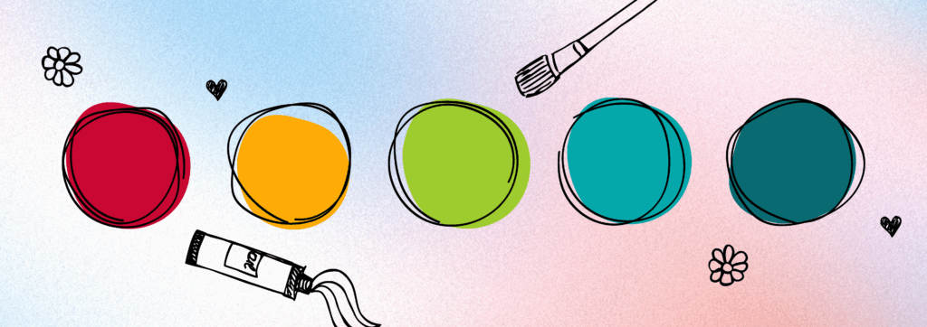
Let’s Explore Some Key Colors:

Red: Power, Passion, Fearlessness
Emotional Associations: Excitement, Energy, Anger, Defiance
Red is often a persuasive color that’s used to create a sense of urgency, prompting consumers to buy products. It’s bold and commonly associated with pride and confidence. However, the negative associations with red can also be powerful, as it can evoke feelings of anger, danger, and aggression. In branding, red can be an effective and bold choice, if used carefully and in the right context.
The Madison+Main Design Team’s Thoughts on Red:
When asked how red shows up in brand perception, AJ, Senior Graphic Designer here at M+M, shared a surprisingly cozy take:
“I’ve always liked Target because everything is red,” she said. “I never feel cold in Target—I always feel very warm and bright.”
Her comment shows how red, often labeled as aggressive or loud, can also create a sense of warmth and familiarity when used thoughtfully.

Blue: Loyal, Respectful, Social
Emotional Associations: Trust, Logic, Security
Blue: the world’s favorite color! Brands agree that it’s a popular and versatile choice. Blue makes us feel cool, calm, and collected, and the top 33% of businesses reflect that vibe in their logos. It can foster feelings of strength, wisdom, and dependability. However, there are also downsides – Blue can sometimes convey a sense of coldness or unfriendliness to consumers. Are you wise and dependable or cold and bitter? Using the world’s favorite color might make you think twice!
The Madison+Main Design Team Thoughts on Blue:
Creative Director Carissa had strong feelings about blue’s dominance in branding:
“The color is overdone, but it’s in every industry,” she noted, adding that it reminds her of banks because it’s “one of the least offensive colors to use.”
To her, blue feels safe, sometimes too safe. While it’s a go-to for trust, it can lack originality if not used with intention.

Yellow: Independent, Strategic, Impulsive
Emotional associations: Optimism, Warmth, Happiness
Everyone loves an attention-grabbing color like yellow. A color of optimism and happiness, yellow can evoke feelings unlike any other. However, it also has a flip side. Yellow can symbolize fear, anxiety, and danger. Often used for road signs, it can create a sense of urgency or caution. It’s important to think about whether you’re portraying happiness or danger for your brand.
The Madison+Main Design Team Thoughts on Yellow:
Carissa admitted she “never uses yellow or orange” and finds it a “struggle” to incorporate into her work.
In contrast, Elizabeth, one of our Graphic Designers, noted that yellow and other soft pastels work well for Jenna, our Senior Graphic Designer:
“She’s a very warm person—she’s soft and leans toward warmer colors.”
This shows how personal style and personality often shape how designers connect with and apply color and how it’s often reflected in their work.

Green: Adventurous, Competitive, Disaffected
Emotional associations: Health, Hope, Freshness
Green feels like a breath of fresh air—literally! It is commonly found in trees, grass, and flowers; fundamental components of the natural world that universally symbolize life. Along with shades of blue, it’s one of the most popular brand colors. However, no color is universally loved. Green can also be associated with feelings of blandness, boredom, or envy. So when deciding how to use this color, take time to consider how consumers might perceive it with regards to your brand.
The Madison+Main Design Team Thoughts on Green:
When asked how the team felt about green in branding, our Graphic Designer Elizabeth shared:
“It depends on the shade of green. Some take my mind to the outdoors, others make me think of banking.”
This highlights green’s versatility toward earthy tones for eco-conscious brands, and deeper, cooler greens for financial trust and stability.
Before We Go
The insight from our design team on how primary colors helps reveal how consumers might perceive certain brands. The team agreed they each have their own go-to palettes they use frequently – and so do the best brands.
Creative Director Carissa shared she’s especially drawn to raspberry and teal, while Elizabeth gravitates toward black, white, and navy. The team also noted that Elizabeth favors rich jewel tones in her personal style. On the other hand, Jenna is very soft and wears a lot of pastels while AJ utilizes a lot of warm tones like yellows.
It’s important to define your personal palette and understand how it influences your work and connection with brands. At Madison+Main, color is more than just a design choice—it’s a powerful, strategic tool to authentically connect with your audience and build lasting relationships. Whether you find comfort in classic black and white, or embrace the full rainbow, we’re here to help you find your true colors and surpass the competition. Just give us a call at 804-521-4141 to put the expert team at Madison+Main on your team to find your brand’s own true hues.