There’s Nothing Funny About Comic Sans
This week’s guest writer for the Weekly Report is Jr. Graphic Designer AJ Stuit, a font fanatic who believes typography is more expressive than the Mona Lisa. If you can’t tell, she’s pretty sarcastic.
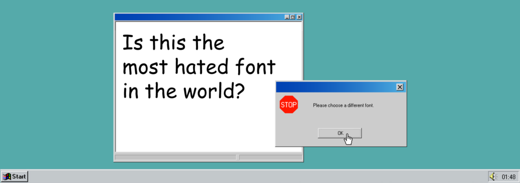
As a graphic designer, I often find myself scrolling through the endless selection of fonts that I’ve collected over the years (my MacBook weighs five pounds more than yours, I’m betting). So many fonts look neat and pretty and sophisticated. Others are bold and brash and bodacious. One, in particular, makes designers everywhere cringe — Comic Sans. When I look at this font I ask myself, “Wow, is it 1995?”
Well, it was designed by Vincent Connare in 1994, and was originally meant for use in a cartoon character’s speech bubble. But it exploded in popularity, partially due to its high ranking in a list of alphabetical fonts and because it’s been a mainstay of every Windows-based system for 25 years.
YES, Comic Sans is very legible. It has legitimate uses. Elementary school teachers use it for hallway bulletin boards, along with another childish font CurlzMT. Comic Sans can be beneficial to kids who have reading disabilities because it resembles handwriting. But this common classroom usage is most likely a large reason that the design-inclined put it on the naughty list.
Designers typically place Comic Sans in the “Do Not Use” category, except for very special cases. The below fonts are more examples of fonts you shouldn’t use. #Ever
In reality, no font is truly bad — it’s just not right for the job. Curlz MT is meant for birthday cards for little girls. Jokerman is meant for business cards…if you’re a professional rodeo clown, and Papyrus should only be used for movies called Avatar.

and last but not least…

If you’re communicating with kindergartners, then by all means, drop some Comic Sans on the coloring page design, but it should never be used on company-wide memos or your website. From my perspective, design is a method of communication and expression, not a set of absolute laws that MUST be followed NO MATTER WHAT. So, do we advise against these fonts? Yes. Should you break our rule and use them anyway? Sure, go for it. I’m AJ, and that’s my #TwoCents.
MONDAY:
WE’RE DOWN WITH BROWN
Brown Distributing Company has officially joined the Madison+Main family. The Richmond-based, family-owned beer, wine, and spirits distribution company has grown from a producer of a single cherry soda to a highly regarded beverage distribution leader in Virginia and Florida. After years of consuming many of their various products, I am very excited to have them as a client. Keep an eye out for some amazing work coming up, including a brand new website.
TUESDAY:
FORT MONROE COMMEMORATION
On Tuesday, I learned that Fort Monroe is hosting a special event on September 18 to commemorate the 10-year anniversary of the transfer of Fort Monroe from the Department of the Army to the Commonwealth of Virginia. There will be numerous educational events, history interpreters, interactive booths, and food vendors.
WEDNESDAY:
QUESTION WEDNESDAY
This week’s Question Wednesday at Madison+Main kicked off with “What’s the most adventurous thing you’ve ever done?” I got to learn about my coworkers’ dangerous sides, including a few stories about breaking and entering (albeit accidentally), and inspiring travel stories. All in all, I work with a pretty tame bunch. My answer was purchasing the Tug Life, despite never captaining a boat before, and sailing her 1,138 miles to Florida. #BoldBoatsWin
THURSDAY:
LUNCH & LEARN
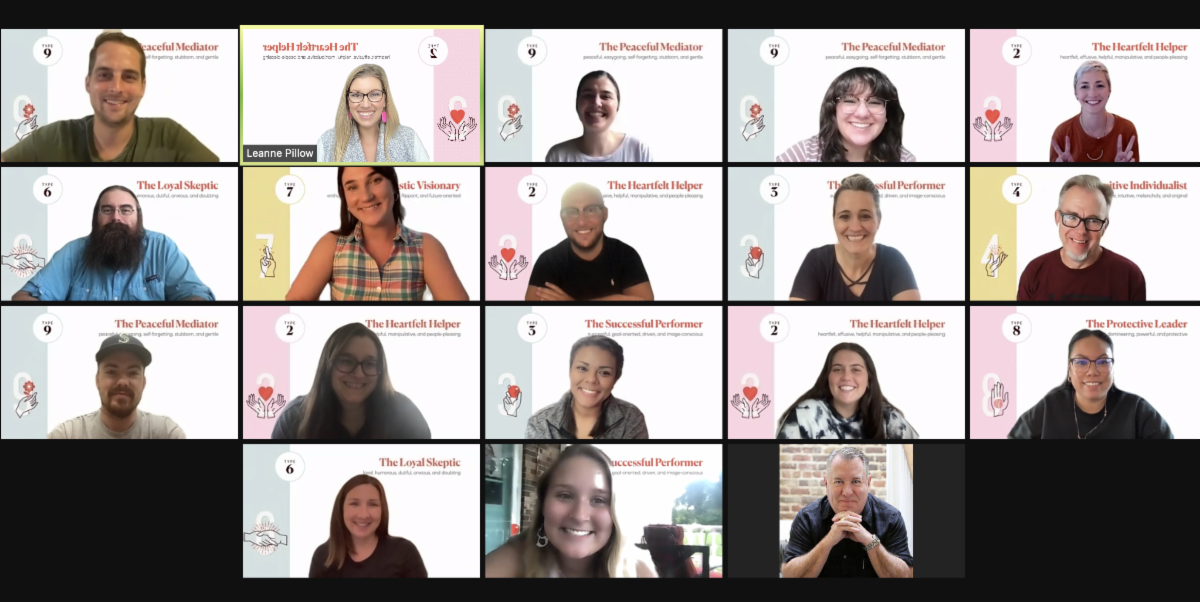
On Thursday, the team participated in a “Lunch and Learn” about our various Enneagram profiles and how they impact our communication styles in the workplace. Client Services Manager Katie Rossberg, Sr. Art Director Carissa Ghaffari, and Office Manager Mollie Banks put together an informative, insightful presentation. I’m a solid #7. Definitely not a 10. Stay tuned in a couple of weeks I will be writing an article about Enneagram profiles and how they are important to fostering better communication in the workplace.
FRIDAY:
KINDA BE KIND
Did you know that September is #NationalCourtesyMonth? One of the greatest novelists in the English language, Henry James, once said, “Three things in human life are important: The first is to be kind; the second is to be kind; the third is to be kind.” Whether you plan to lend a helping hand to someone in need, practice using good manners, or decide to offer me your winning lottery ticket — a little courtesy goes a long way.
A FEW OF OUR FAVORITE EVENTS
Green Top Outdoor Expo
Ashland, VA
October 2-3, 2021
Green Top is proudly hosting a FREE family-friendly customer appreciation event that features hundreds of vendors, product demos from the most popular outdoor brands, and exhibits, plus industry expert meet-and-greets, great food, live music, and so much more. This is the largest outdoor expo in the Mid-Atlantic, so don’t miss out!
Magnificent Midlothian Food Festival
Westchester Commons
Saturday, October 9, 202112-7 p.m.
Enjoy plates from area restaurants, local craft beer, Virginia wines, and more! Plus, live music throughout the day andan expanded kids area! Grab your tickets today!
Perkinson Center for the Arts & Education Performances
Chesterfield, VA
New Performances Weekly!
Check out a plethora of performances at Chesterfield’s Premier Center for the Arts & Education — including a new gallery show! Tickets can be bought online.
Got an upcoming event you want to share? Can we come? Send us the deets!
“I always bring my kids vacation souvenirs printed in Comic Sans, so they know I love them but not unconditionally.” — Ken Jennings